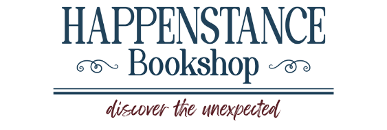
The Journey to Our Happenstance Bookshop Logo
Finding the perfect logo for Happenstance Bookshop has been a journey—one that’s been filled with creativity, trial and error, and, of course, lots of serendipity.
The Design Brief
It all began with a design brief. We knew what we wanted: a logo that felt warm, inviting, and community-centered, much like our vision for Happenstance Bookshop. A cozy, curated place where stories meet and connections spark. The brief was clear: incorporate elements like books, subtle embellishments, and a tagline—Discover the Unexpected. We wanted a balance of elegance and charm, with a color palette rooted in rich, earthy tones and timeless navy hues.
We hired a designer on Etsy, sent them the brief, and waited eagerly for the first round.
The First Round: Logos 1, 2, and 3
When we received the first three logos, it was a mix of excitement and critical evaluation. Each one had merit, but they weren’t quite it.
Logo 1 had great bones but felt a little too formal for our taste.
Logo 2 was charming but lacked some of the clean sophistication we envisioned.
Logo 3—now, Logo 3 sparked something. There was something lovely about it. But it wasn’t quite there yet.
We gave thoughtful feedback:
“The tagline, ‘Discover the Unexpected,’ is hard to read. The kerning feels too tight, and the curve isn’t quite the right shape. Could we try moving it to the bottom and making the books a bit larger?”
The embellishments—delicate curly Q’s—were also a sticking point. While beautiful, they felt overly intricate and might get lost when resized. We asked:
“Are there simpler options for elegant flair that won’t disappear at smaller scales?”
Finally, we reimagined the color palette. The original brown felt off-brand for us. Instead, we suggested a combination of burgundy and navy—rich, timeless, and cozy.
The Next Steps: Logos 4 and Beyond
The designer sent back updated versions—Logo 4A and 4B—reflecting our feedback. Progress was being made, but we noticed that the word Bookery was still a touch too small. If we wanted the logo to shine on everything from store signage to social media, legibility was key.
After more tweaks, Logos 5, 6, and 7 were born. And they were good. Each option felt aligned with our vision, with Logo 7 standing out as the clear favorite. It was polished yet warm, elegant yet inviting. We had a winner!
A Last-Minute Twist: A Name Change
Here’s where the plot thickens. As we finalized Logo 7, we made a big decision: to change our name. Instead of Happenstance Bookery, we’d become Happenstance Bookshop. The word Bookshop felt simpler, more familiar, and better aligned with our identity.
So, back to the drawing board we went. This time, though, we knew exactly what we wanted. Armed with our original mood board, color palette, and refined design ideas, the final logo came together seamlessly. It felt like it was meant to be.
The Final Logo
And there it is—our Happenstance Bookshop logo. A culmination of feedback, revisions, and a sprinkle of serendipity. It captures everything we hoped for:
A Cozy Charm: It feels like a place you want to curl up with a good book.
Subtle Elegance: Clean lines and tasteful embellishments make it versatile and timeless.
Discover the Unexpected: The tagline, perfectly placed, invites readers into a space of curiosity and connection.
We love it. And we hope you do, too.
This process reminded us that finding the right logo—like finding the perfect book—isn’t always linear. It’s a journey of discovery, reflection, and refinement. After all, that’s what Happenstance is all about.
Here’s to stories, connections, and a logo that feels like home.


